Shape
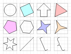
The Shape control allows you to embed simple graphic objects into your report. You can choose one of multiple predefined shapes (e.g. rectangles, ellipses, arrows, polygons, crosses and brackets of various kinds).
In the Property Grid, the Shape's properties are divided into the following groups.

 Appearance
- Background Color
Specifies the background color for the control. This option is also available in the Formatting Toolbar (
 ).
). - Borders, Border Color and Border Width
Specify border settings for the control.
- Fill Color
Specifies the color to fill the contour of a Shape, if applicable. It is transparent by default.
- Foreground Color
Determines the color of a Shape's contour. This option is also available in the Formatting Toolbar (
 ).
). - Formatting Rules
Invokes the Formatting Rules Editor allowing you to choose which rules should be applied to the control during report generation, and define the precedence of the applied rules. To learn more on this, refer to Conditionally Change a Control's Appearance.
- Line Width
Here you can set the width of a line used to draw the Shape, expressed in the measure units defined by the report's Measure Units property. To learn more about this, refer to Change Measurement Units of a Report.
- Padding
Specifies indent values which are used to render the contents of the control.
- Style Priority
Allows you to define the priority of various style elements (such as background color, border color, etc.). For more information on style inheritance, refer to Understanding Style Concepts.
- Styles
This property allows you to define odd and even styles for the control, as well as to assign an existing style to the control (or a newly created one). For more information on style inheritance, refer to Understanding Style Concepts.
Behavior
- Anchor Vertically
Specifies the vertical anchoring style of the control, so that after page rendering it stays attached to the top control, bottom control, or both.
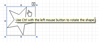
- Angle
The value in degrees specifies the rotation angle of a Shape. It indicates counterclockwise rotation.
You can hold CTRL while pressing the left mouse button to rotate a Shape within the control's borders.
- Scripts
This property contains events, which you can handle with the required scripts. For more information on scripting, refer to Handle Events via Scripts.
- Shape
Determines which of the various built-in shapes to use within the control.
A certain shape has its own unique set of properties. The following list is intended to give a brief overview of these special properties specific to a certain shape.
|
Property |
Description |
Supported by Shapes |
|---|---|---|
| Fillet | This property specifies how much a Shape's corners are rounded. It enables display of rounded boxes and triangles. | Arrows, Polygons, Stars and Cross |
| Number of Sides | This property allows you to set the number of sides. | Polygons |
| Count of Star Points | This property allows you to set the number of star points. | Stars |
| Concavity | Defines the level of inward-curve for the lines connecting the vertices of a Star. It may be an integer in the range of 0 - 100. | Stars |
| Tip's Length | This property specifies the length of the Bracket's ends. | Bracket and Brace |
| Tail's Length | This property specifies the tail length of a Brace. | Brace |
- Stretch
If the Shape is rotated to some degree (that is, its Angle property is not zero), you may turn on the Stretch property. The Shape image will be stretched to cover maximum space within the control's borders.
- Visible
Specifies a value indicating whether the current control should be printed (when set to Yes) or hidden (No) on report generation.
Data
- (Data Bindings)
If the current report is bound to data, this property allows you to bind some of the control's properties (Bookmark, Navigation URL and Tag) to a data field obtained from the report's data source, and to apply a format string to it. For more information on this, refer to Displaying Values from a Database (Binding Report Elements to Data).
- Tag
This property allows you to add some additional information to the control; for example its id, by which it can then be accessible via scripts.
If the current report has a data source, the Tag property can be bound to a data field obtained from the data source. To do this, expand the (Data Bindings) property and in the Tag.Binding drop-down selector, select the required data field.
Design
- (Name)
Determines a control's name, by which it can be accessed in the Report Explorer, Property Grid or via scripts.
Layout
- Location
Specifies the control's location, in report measurement units.
- Size
Specifies the control's size, in report measurement units.
- Snap Line Margin
Specifies the margin (in report measurement units), which is to be preserved around the control when it is aligned using Snap Lines, or when other controls are aligned next to it.
Navigation
- Bookmark and Parent Bookmark
These properties are intended for the creation of a hierarchical structure within a report called a document map. For an explanation and help, refer to Add Bookmarks.
If the current report has a data source, the Bookmark property can be bound to a data field obtained from the data source. To do this, expand the (Data Bindings) property and in the Bookmark.Binding drop-down selector, select the required data field.
- Navigation URL and Navigation Target
Use the Navigation URL property to specify a URL for web browser navigation when a user clicks the control. The web browser displays a page in a window or a frame as specified by the Navigation Target property. Note that a URL should have an appropriate prefix (e.g. "http://"). You can create cross-references within the report by assigning the name of the target control to the Navigation URL property, and setting the Navigation Target property to "_self". For more information, refer to Create Hyperlinks.
If the current report has a data source, the Navigation URL property can be bound to a data field obtained from the data source. To do this, expand the (Data Bindings) property and in the Navigation URL.Binding drop-down selector, select the required data field.