Ribbon Designer Elements
This document describes elements that comprise the Ribbon Report Designer.
The following image illustrates a Ribbon Designer.
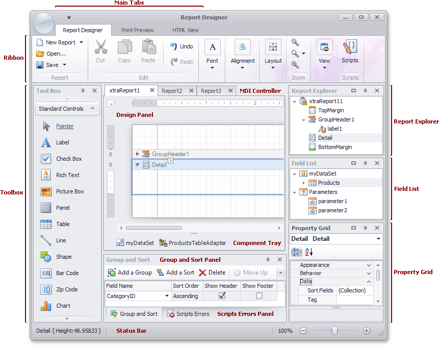
The following table lists all the main interface elements of the Ribbon Designer.
|
Element |
Description |
|---|---|
| Ribbon |
The main toolbar in the Designer that contains the Main, Formatting, Layout and Zoom toolbars, as well as the Scripts Tab button. |
| Toolbox |
Contains controls that you can add to your report by dragging and dropping its icons onto a report's area. |
| Main Tabs |
Allows you to switch between the Designer, Preview and HTML View tabs. |
| MDI Controller |
Provides the multi-document interface in the Designer by containing its Design Panels. |
| Design Panel |
A surface where a report is being edited. The Designer provides a multi-document interface, and can have as many Design Panels as there are reports open in it. |
| Component Tray |
Shows components related to report data binding. You can click them to display and edit their settings using the Property Grid. |
| Report Explorer |
Displays the structure of a report in a visual-tree form, which makes the report navigation easier. |
| Field List |
Shows the structure of a report's data source and is used to bind report controls to data. |
| Property Grid |
Used to access and modify properties of a report and all its elements (bands and controls). |
| Group and Sort Panel |
Allows you to quickly perform grouping and sorting operations throughout a report, and visually represents the report's grouping structure. |
| Scripts Errors Panel |
When errors are found in a report's scripts (after clicking Validate in the Scripts Tab), it lists these errors. Clicking an error opens the corresponding script section in the Scripts tab. |
| Status Bar |
Provides tips and specific information about the Designer element being hovered by a cursor or an action being currently performed. |