Gauge
The Gauge control provides you with the capability to embed graphical gauges into your report.
In the Property Grid, the Gauge control's properties are divided into the following groups.

 Appearance
- Background Color
Specifies the background color for the control. This option is also available in the Formatting Toolbar (
 ).
). - Borders, Border Color and Border Width
Specify border settings for the control.
- Foreground Color
Specifies the text color for the control. This option is also available in the Formatting Toolbar (
 ).
). - Formatting Rules
Invokes the Formatting Rules Editor, which allows you to choose which rules should be applied to a control during report generation, and define the precedence of the applied rules. To learn more on this, refer to Conditionally Change a Control's Appearance.
- Padding
Specifies the indent values that are used to render the contents of a Label.
- Style Priority
Specifies the priority of various style elements (such as background color, border color, etc.). For more information on style inheritance, refer to Understanding Style Concepts.
- Styles
Assigns an existing (or newly created) style to the control, and also specifies odd and even styles. For more information on style inheritance, refer to Understanding Style Concepts.
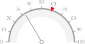
- View Style
Specifies the style of the displayed gauge.
- View Theme
Specifies the color theme of the displayed gauge.
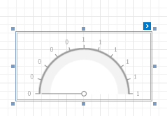
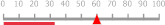
- View Type
Specifies the type of the displayed gauge. The following view types are supported.
- Circular
- Linear
- Circular
Behavior
- Anchor Vertically
Specifies the vertical anchor style of the control, so that after a page is rendered it stays attached to the top control, bottom control, or both.
- Scripts
This property contains events that you can handle with the required scripts. For more information on scripting, refer to Handle Events via Scripts.
- Visible
Specifies whether or not the control should be visible in a print preview.
Data
- (Data Bindings)
If the current report is bound to data, this property allows you to bind some of the control's properties (Bookmark, Navigation URL, Tag and Text) to a data field obtained from the report's data source, and to apply a format string to it. For more information on this, refer to Displaying Values from a Database (Binding Report Elements to Data).
- Actual Value
Specifies the value displayed by a gauge.
- Maximum
Specifies the gauge’s maximum value.
- Minimum
Specifies the gauge’s minimum value.
- Tag
This property allows you to add some additional information to the control; for example, its id, by which it is then accessible via scripts.
- Target Value
Specifies the position of the target value marker.
Design
- (Name)
Determines the control's name by which it can be accessed in the Report Explorer, Property Grid or via scripts.
Layout
- Location
Specifies the control's location in report measurement units.
- Size
Specifies the control's size in report measurement units.
- Snap Line Margin
Specifies the margin (in report measurement units) around the control when it is aligned using Snap Lines, or when other controls are aligned next to it.
Navigation
- Bookmark and Parent Bookmark
These properties are intended for the creation of a hierarchical structure within a report called a document map. For more information, refer to the Add Bookmarks topic.
If the current report is bound to a data source, the Bookmark property can be bound to a data field, obtained from the data source. To do this, expand the (Data Bindings) property, and in the Bookmark.Binding drop-down selector, select the required data field.
- Navigation URL and Navigation Target
Use the Navigation URL property to specify a URL for web browser navigation, when a user clicks a Label. The web browser displays a page in a window or a frame as specified by the Navigation Target property. Note that a URL should have an appropriate prefix (e.g., "http://"). You can create cross-references within the report by assigning the name of the target control to the Navigation URL property, and setting the Navigation Target property to "_self". For more information, refer to Create Hyperlinks.
If the current report is bound to a data source, the Navigation URL property can be bound to a data field obtained from the data source. To do this, expand the (Data Bindings) property, and in the Navigation URL.Binding drop-down selector, select the required data field.